A breakdown of my workflow and the techniques used
Recently I posted SCAVENGER, a real-time 3D scene in Unity of a traveller in the desert inspired by Dune, The Force Awakens and the illustrations of Moebius. Let’s go over some of the techniques and workflow I used to put this scene together.
Goal
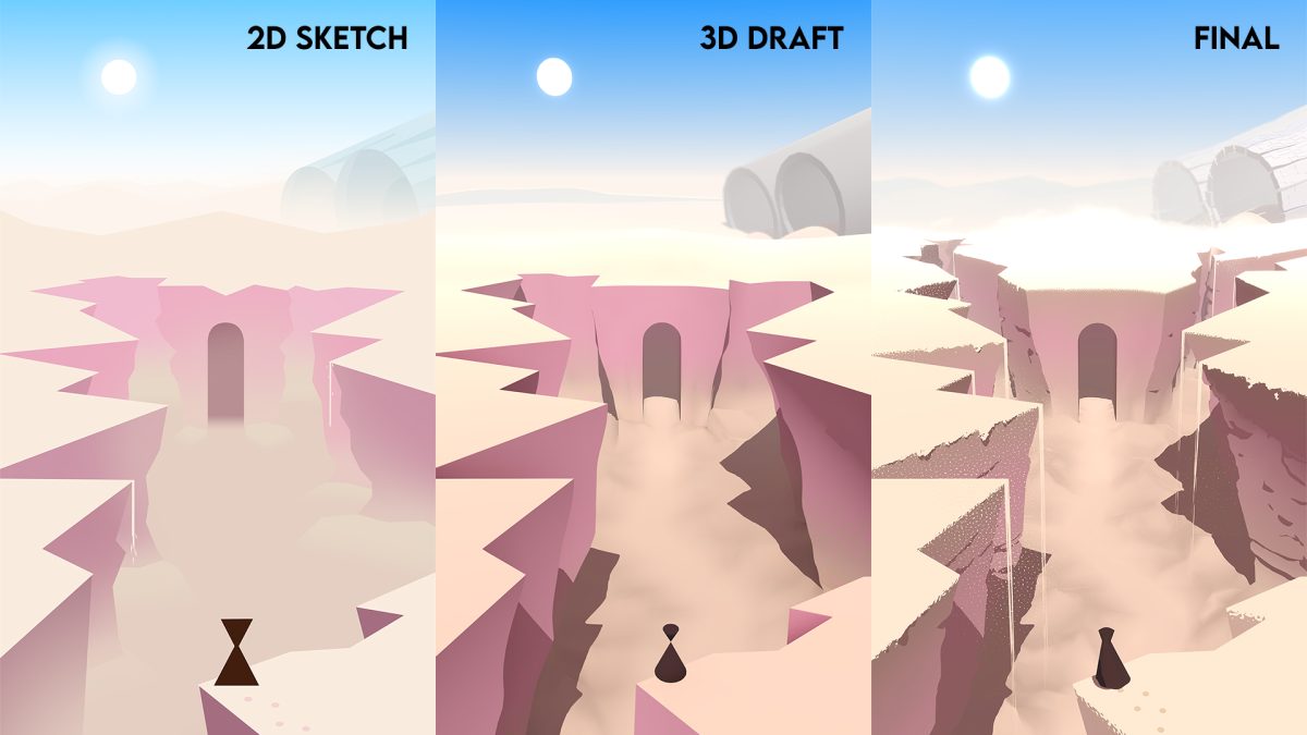
I have a lot of love and respect for 2D art, but I’m a programmer by trade so there was a time where I found myself intimidated at the prospect of painting an entire scene in Photoshop. A friend of mine and fantastic illustrator Benjamin Paulus once urged me to just open Photoshop and start using the polygonal lasso tool to carve out interesting shapes and quickly hash out an idea for an environment. Remembering his advice, after browsing Pinterest a bit for inspiration I sat down and doodled this:
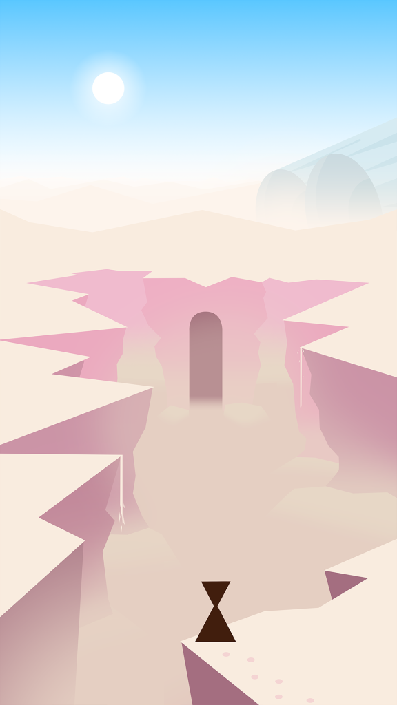
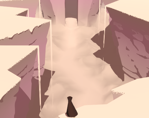
I came up with a scene that I liked: a very simple character with a triangle for a body and an inverted triangle for a head, amidst a jaggy canyon in the middle of the desert. The juxtaposition of some ancient temple and a crashed space vehicle made the setting interesting to me. Of note were the very simple shapes with strong leading lines and bright colours.
This was also the most important thing that I wanted to translate to 3D.
It should look like it could have been drawn that way, as opposed to a traditionally 3D-looking scene.
Initial Project Setup
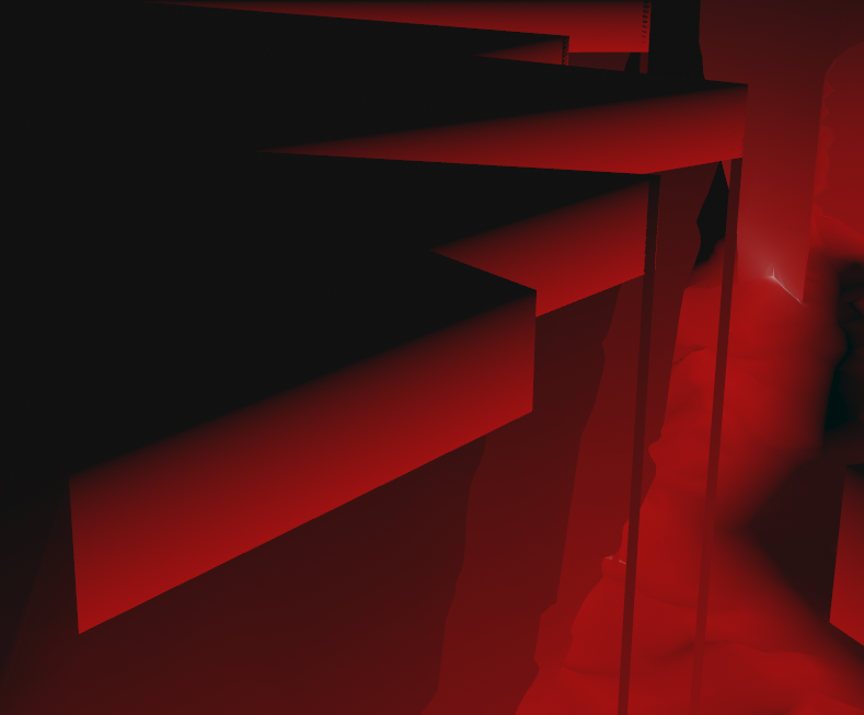
First order of business was opening up Unity and placing a 2D canvas in the scene so I could overlay the sketch onto the 3D scene and try to align all the major landmarks. I decided on how tall the character should be approximately, then based on that I decided how large the entrance to the temple should be, and from that I could approximate their relative position and the camera angle needed to get them to align. I modelled it all by hand, and using stock Unity lighting, that led me to this:
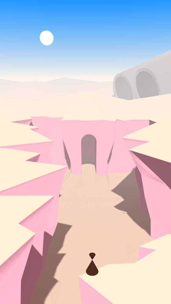
I’m sure we can agree it doesn’t look very good, but it definitely is the thing that I drew. I prefer writing shaders through code rather than shader graphs, so I went with a Built-In Render Pipeline project. I used the linear colour space, and I also went with Deferred Rendering. In my experience Deferred Rendering lets you have a lot of control over how the lighting looks, because you have more information available to you by the time lighting gets applied. Especially if you’re working in code you can really get your hands dirty and change how rendering works.
The way I like to work with stylized lighting is to use a Physically Based Lighting Model as a starting point and then manipulate and exaggerate things as needed. This lets you work with assets in a familiar workflow (define smoothness / metallic values) and grounds your more abstract visuals in a kind of realistic fidelity.
Built-in Shader Customization
In the Graphics settings of your project you can override built-in shaders with your own. If you download the corresponding built-in shader from the Unity Hub you can move a copy to your project, and drag that in to replace the original shader. You can now customize it to your heart’s content.
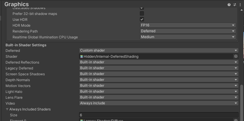
I override DeferredShading because that’s the most pivotal shader in deferred rendering. It’s responsible for the light passes, so with that you can customize how everything is lit, which is a huge part of establishing the look of a scene. It has the Bidirectional Reflectance Distribution Function (BRDF) which approximates realistic physics-based lighting calculations based on surface properties. This is really interesting to tweak, and I will probably do that in the future. I think I’d like it if the environment had Physically Based Shading but characters had very simple and traditional cel-shading. This could be accomplished by creating a material buffer to apply different lighting to different objects. There’s a great video about how this technique is used in Breath of the Wild, but for now I will instead be focusing on the way shadow maps are composited into the light colour, so I can make shadows nice and crispy. The environment will then still be shaded in a Physically Based-way, but because the normals are simplified this will still result in a smoother, less detailed look and contribute to the “illustrated feel”.
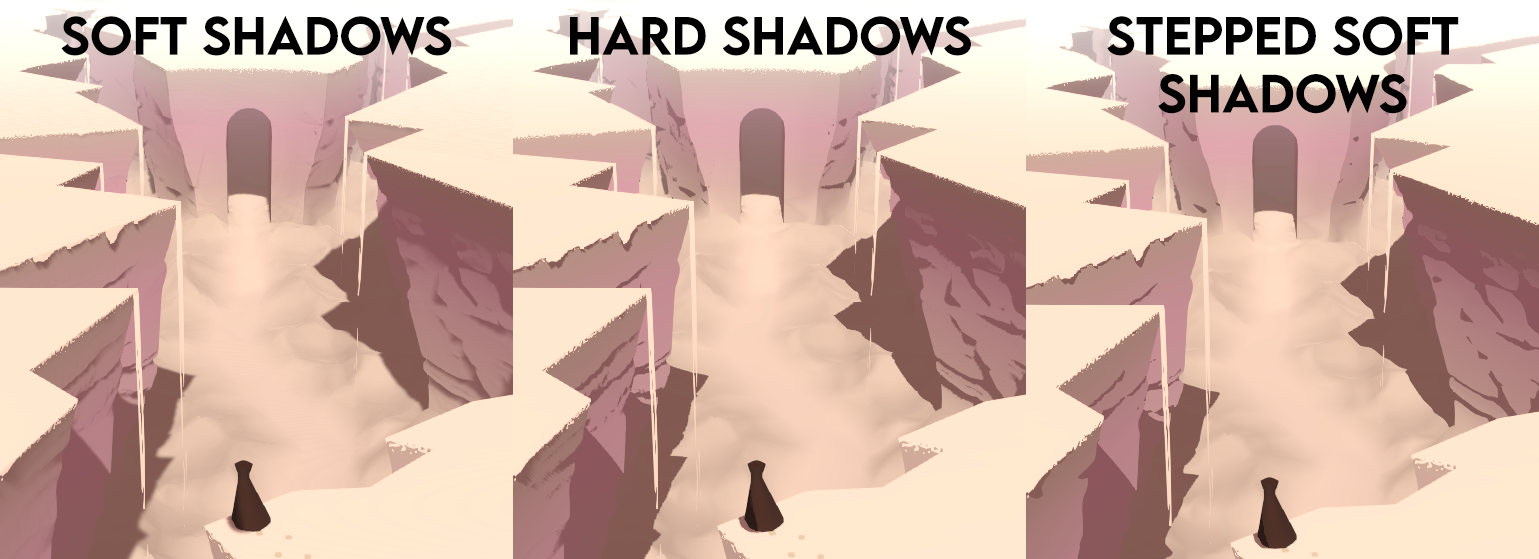
Crispy Shadow Maps
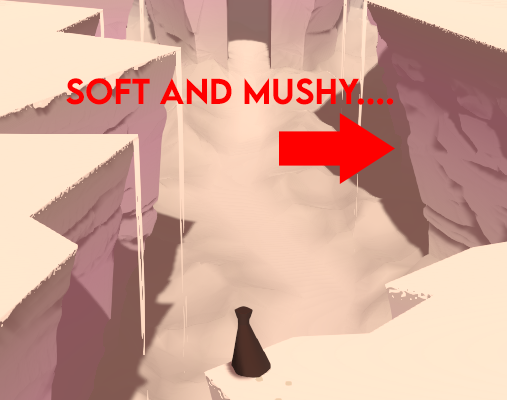
By default the shadows look very soft and “mushy” for lack of a better word. This is the first and foremost thing that betrays that this is a 3D render and not something illustrated by hand. Your first inclination might be to set the direction light’s shadows to Hard instead of Soft.
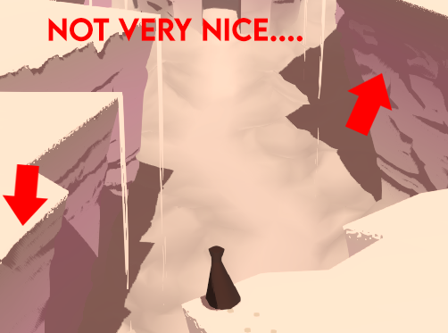
As you can see this will indeed make it harder, but you will get rasterization artifacts along steep angles. Overall you will get a more pixelated look. Luckily I know just the thing! Why not take the nice smooth Soft shadows and apply a Step function to make it have a sharp fall-off along smooth lines?
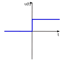
For those who don’t know, a step function takes a threshold value and an input value and returns 1 if the input is greater than the threshold, and 0 otherwise. This lets you make a very sharp crispy transition like so:
If we make a copy of UnityDeferredLibrary.cginc and use that copy in our Internal-DeferredShading.shader copy we can modify the shadow mapping compositing to apply a step function.
Look for the UnityDeferredSampleRealtimeShadow function and add the following line:
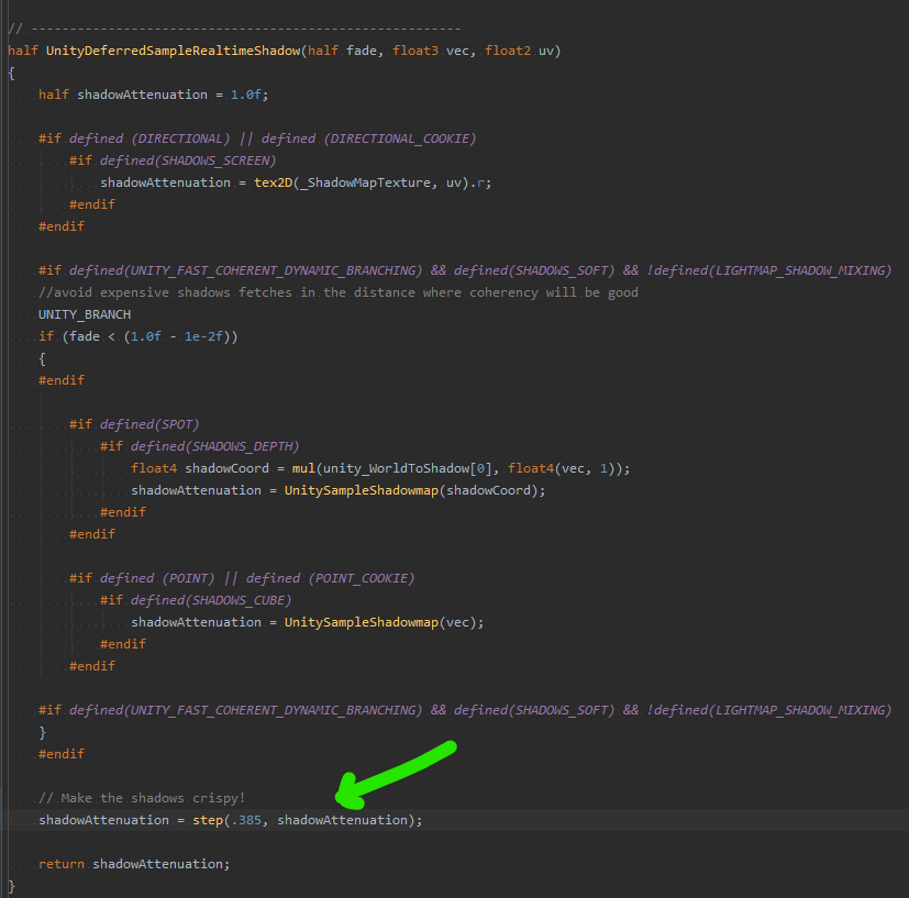
You can play with the threshold value to change where the transition from light to dark happens to simplify the shape of the shadows.
Now we end up with the following shadows:
You can compare the different shadow techniques here:
Making it Procedural
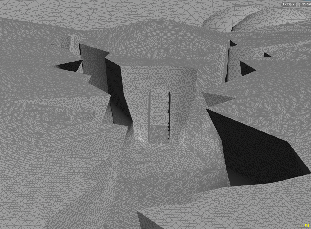
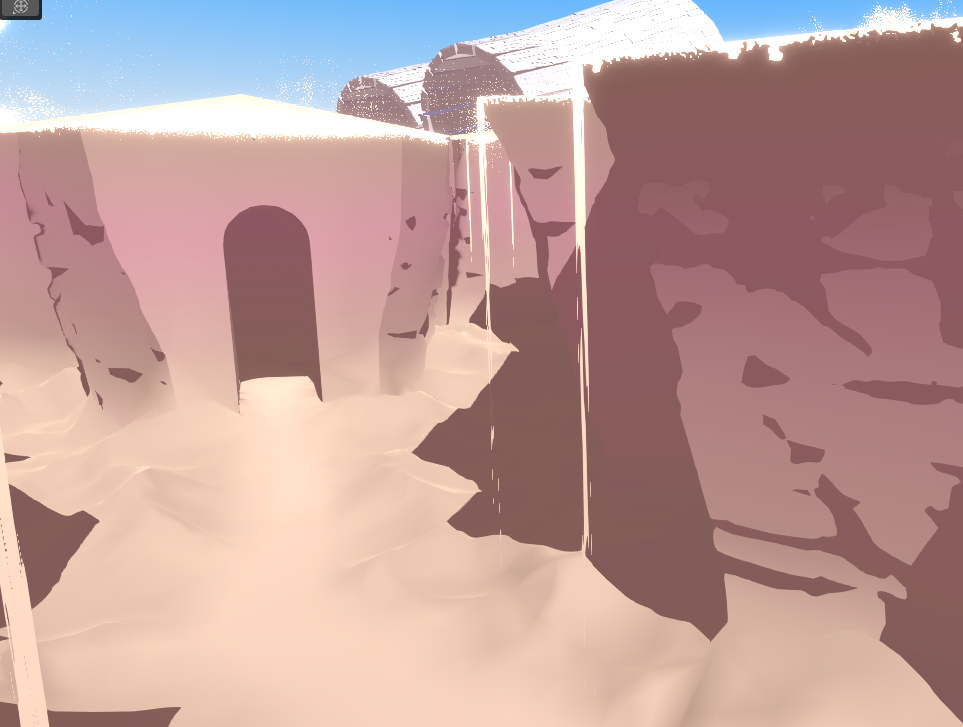
I got some feedback on the scene from RickyLauw, and he suggested pulling the cliffs further into the background to create more depth and draw more attention to the big turbines in the back. The cliffs were modelled by hand so changing the cliffs around a lot was going to be very tedious. I decided to do it more procedurally.

In Houdini I use a boolean subtract node to carve the cliffs out of the terrain. This way I could easily iterate on the shape and make sure that the leading lines are pleasing to the eye. I tried having lots of lines leading to the entrance of the temple, the focal point of the scene.
You can see quite far in the scene so I also remesh the terrain based on distance from the camera, so that the mesh is more detailed up close and gets gradually less detailed further into the background.
I apply some cellular noise to the walls to make boulders, and take a basic Simplex noise that is stretched out a lot on the X and Z axes to carve horizontal lines or “stratas” into the rock.
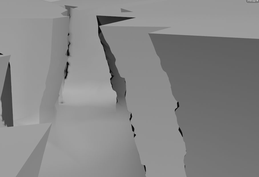
Note that it affects the silhouette but the sides still look very flat. This is because I intentionally don’t re-calculate the normals. This means that the shape is quite detailed but the normals are angled as if it is still a straight line. This is very unrealistic, but it actually creates a much more simpler, aesthetically pleasing look that very much matches the illustrated style we are aiming for. This is a trick I learned from a great GDC Talk about Guilty Gear Xrd. Go watch it, they are the undisputed masters of translating 2D art to real-time 3D.
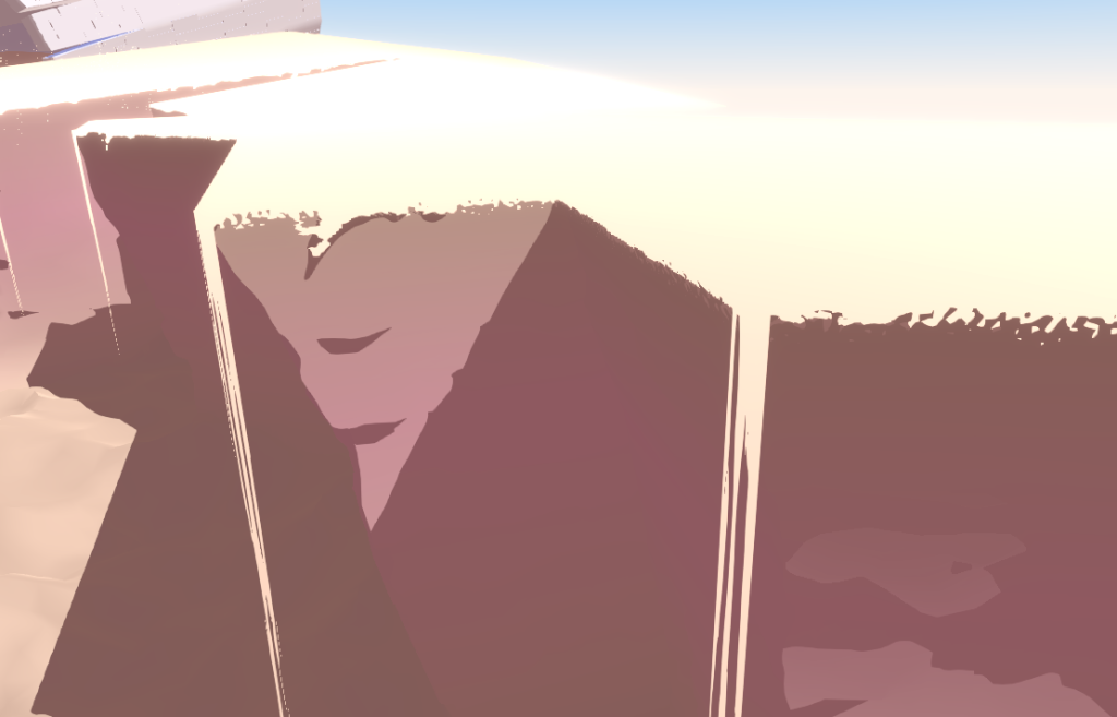
I apply some noise to the sand in the canyon too, I extrude a few edges for various sand cascades and I bake a few masks into the red channel of the vertex colours, for use in shaders later.
Shaders
Now that we have the mesh we can export it from Houdini to Unity. We packed in a lot of data in the vertex colours and UV coordinates to be able to do masks and scrolling textures in the shaders. It’s really gonna bring the scene to life.
In several places we use the red channel of the vertex colours as a kind of mask. For cliffs we interpolate from the cliff colour to the sand colour based on that mask. For the sand cascades we use that mask to determine the cutoff value of the opacity so that the cascades gradually get wispier as they reach the floor.
You might have noticed in the animated version of the scene that every now and then a wave of sand seems to be blown over the edge of the cliff by the wind. This is actually just a mesh extruded down from the edge of the cliff, with two scrolling Perlin noise textures. One is high-frequency and scrolls top to bottom and creates the movement of the falling sand. The other is very low frequency and scrolls left to right. This one makes sure that sand isn’t constantly falling off everywhere and that it comes and goes in waves.
If you want to learn more about combining perlin noises, I recommend reading this earlier blog post about creating an aurora borealis.
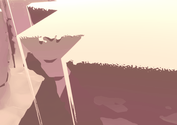
One of my favourite details of the cliffs is that the top of the rocks don’t have a perfectly sharp transition to sand. It’s a bit fuzzy and noisy.
The way I did this is relatively simple. I use the same mask that I use to blend from a rocky colour to the sand colour down below, but I instead use it to figure out where the top of the cliff is. Then I take a very small fraction of the full height of the cliff, like 0.01, and I use that as a mask to blend to the sand colour on top. This would create a smooth transition, which we don’t want. So similarly to how the sand cascades have a perlin noise texture and have its alpha cutoff value gradually go from very low to very high, I use a blue noise texture and use the “edge mask” I described previously as the alpha cutoff. Then you get thick organically-spaced flakes that get thinner and thinner towards the bottom of the mask. There’s a lot to say about what blue noise is exactly but the TL;DR is that it’s a kind of very evenly-spaced noise that doesn’t quickly come across as repetetive. It’s very useful for dithering. You can read up on it a bit more here.
In Conclusion
These are the broad strokes of how I made the scene! There’s a few more tricks to making this scene look good like particles, fog, heat refraction, but they are relatively small details so I won’t go into them at length because it’s already a very, very long blog post. If you’ve enjoyed this breakdown and think it deserves a Part Two, go bother me about it on Twitter! I’m @Roy_Theunissen.
If there’s interest in it I will happily do a follow-up.
Looking back at the scene I’m very happy with how it turned out. It was very fun to make, I feel like I stayed pretty true to the original inspiration of the 2D sketch, but also didn’t stick too closely to it when I had ideas to push it further.
It was a fun experiment and I’d love to return to this world and do further scenes in it.